Follow-up to my German discovery post – this is the bit I actually set out to build in the first place: where my ancestors were, how that shifted generation by generation, without me having to hold the whole timeline in my head.
My map now does that. Every birthplace I've got a coordinate for – 84 of them at last count, going back to 1390 – plots as a dot, coloured by when it happened: red for oldest, sliding through a muted rainbow to purple for newest.
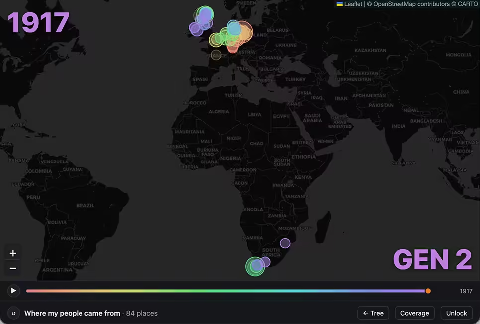
Drag the scrubber and the dots reveal themselves in order, oldest first, each one with a little ping as it lands. A year counter ticks over top-left. A generation counter counts down bottom-right, so you can watch GEN 18 become GEN 17 become GEN 16 in real time, which is a strange thing to see happen to your own family in twenty seconds flat.
That Altona, Hamburg cluster from last post is in there too – it's just one more dot to switch colour along with everything else once the timeline reaches it.
I did try splitting it into two panels first, Europe on top and South Africa on the bottom, on the theory that a single world map wastes most of its space on the empty Atlantic between the two clusters
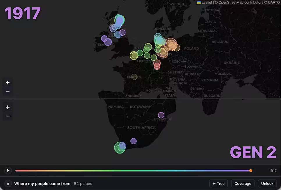
It's technically true and I still don't hate it. But watching two maps update at once turned out to be less compelling than watching one map slowly fill in, so the single map is what's live now.